
In this article we will work in QGIS, which is a free, open-source software. Here I will show you how to create pretty maps, using raster and vector data. If you follow my tips and use similar displays, your customer will be satisfied for sure.
I recommend this writing to those who are less proficient in GIS software and mapping. We will start with a digital elevation model (DEM). With this we will create a slope map, a contour map, and a terrain shading model. In the end, the created map will be easily interpretable and will have a uniform appearance.
While I show you the process on a terrain surface, the same could work on a digital surface model of a city. Moreover, you can apply the practices described here to model roof slopes and heights.
Maps can consist of large files, for example: orthomosaics, digital elevation model (DEM) and vector files (eg contours). It is difficult to share these output files with a client or a colleague. We recommend using the SurveyTransfer data sharing tool to transfer these files.
SLOPE MAP AS THEMATIC CONTENT
How do we start the process? That’s right. Start the QGIS program first. 🙂
After starting it, add the DEM file to the empty map using the sidebar on the left. You can do that with drag-and-drop and by double clicking to the file too. The result will be the same anyway.
Let’s be 100% professional and save the QGIS project file before we start anything. Save can be done with the blue floppy disk icon in the second menu bar.
Sidenote: The QGIS project file will purely contain the actual display and the relative or absolute path of the data. If you try to give the project file to someone without the additional data, then Your client won’t see a thing of your work at all. I suggest you copy the added files to a folder to which you save the “qgs” or “qpz” project files too. This way, if you hand over this whole folder to someone, the person will see everything just as you have saved them.
Note in the note: The path type of the data can be found in the “General” tab, under the “Settings/Options” point of the top menu bar. Due to practical reasons, I suggest it to be always relative.
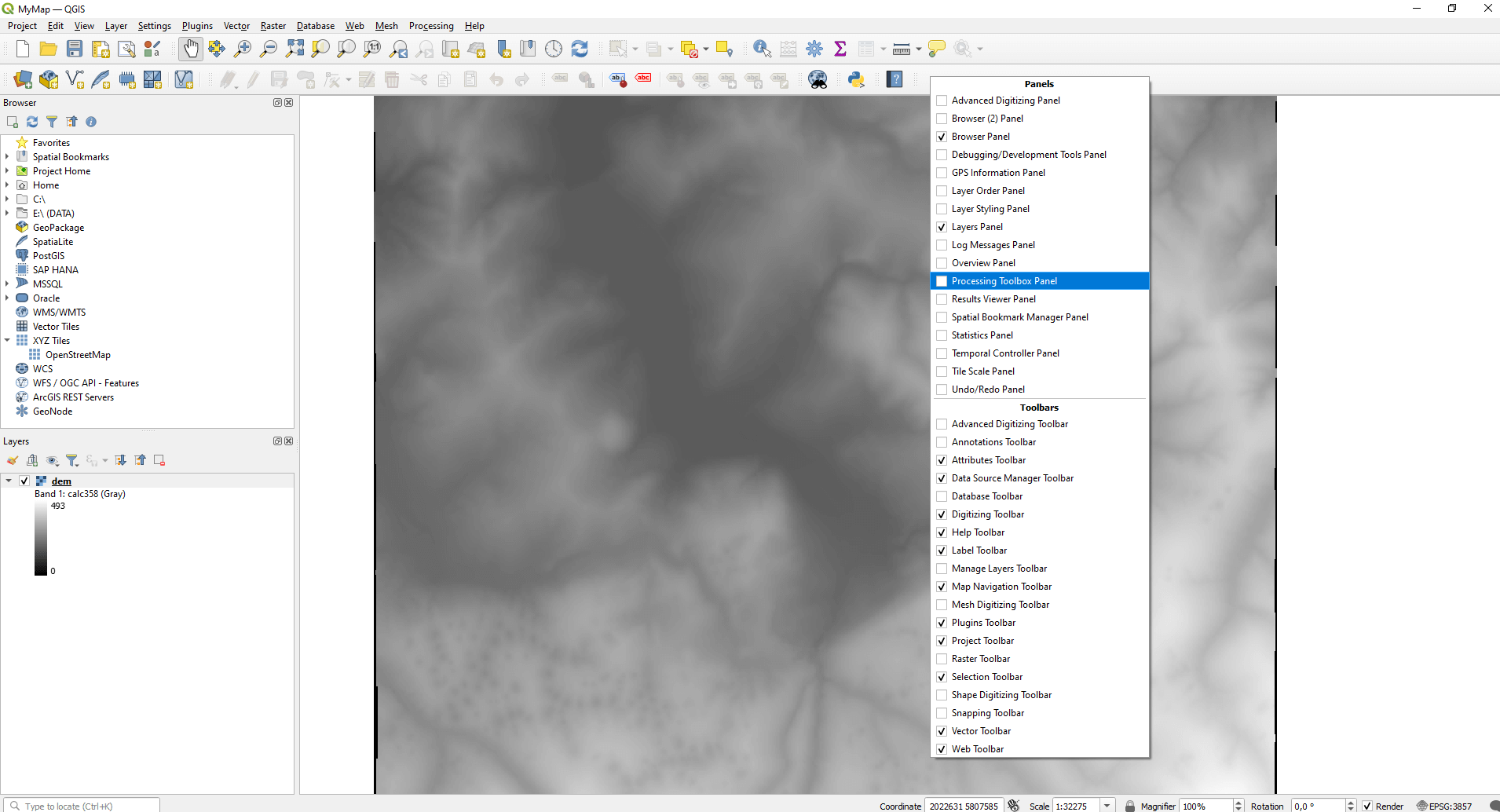
After we finished the previous step, open the “Processing Toolbox Panel”. If you can’t see it yet on the right side, you only have to right click to the menu bar and tick this panel.
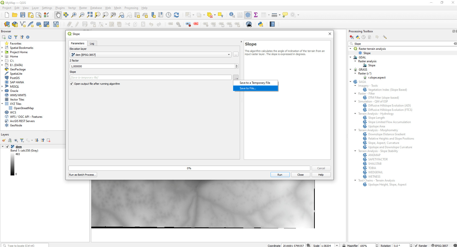
Type “Slope” into the search field and choose the first option under “Raster terrain analysis”. Here I won’t be working with temporary files, but I will create a separate “tiff” file instead. To do this you need to click on the “…” button under the “Slope” subtitle, then choose the “Save file…” option. Run the function with standard settings (“Run”)!
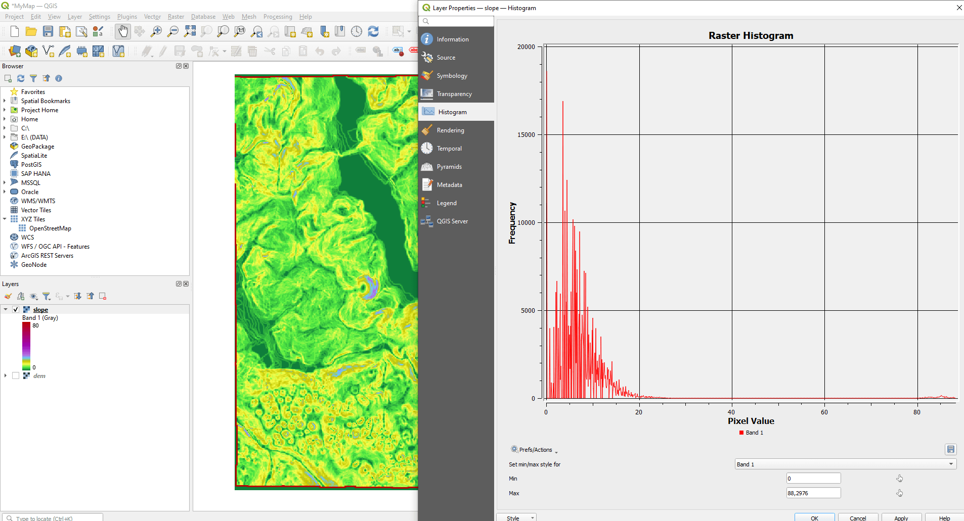
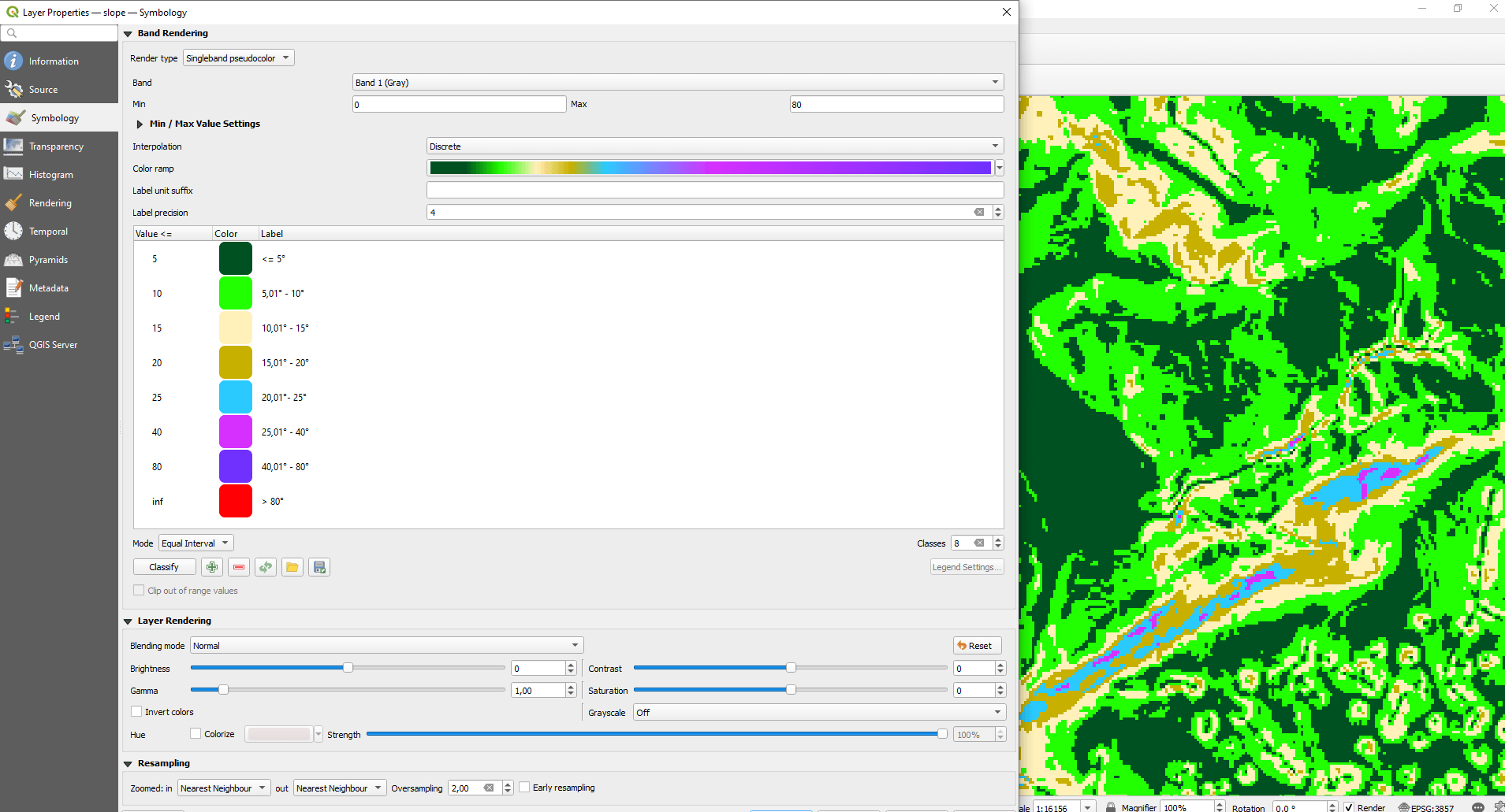
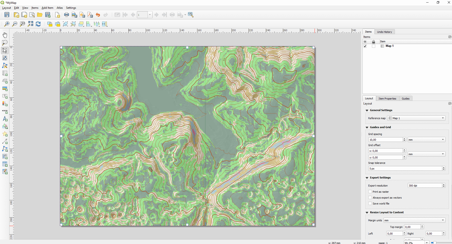
You can change the colors of the raster by double clicking to the new layer on the layer tree. You will find the colors under the “Symbology” menu. If you want to classify the output raster by slope values, you need to know how these values are distributed in your area. The easiest way for that is to analyze the histogram of the raster (under the “Histogram” tab). here you can see which angle value occurs most often, so you can set how to allocate the categories for the purpose of a clear visibility.
Let’s get back to the “Symbology” tab. Set the “Singleband pseudocolor” option next to “Render type”. Then set the “Interpolation” to “Discrete”. Set a color scale, next to “Color ramp”. There is a setting called “Classes” on the right side, under the displayed colors. With this option you can set the number of the class you want your file to be divided into. Once you’re done with this you can set the upper limit of each class by double clicking to the values of the “Value” column. The coloring will be done based on this. Under “Label” you can set the category labels (in the legend) (Spoiler: this will be useful for map creation). At last, it’s worth it to set colors that are easily differentiable. Press “OK” and save the QGIS project file.
CONTOUR MAP – FOR BETTER VISUALIZATION
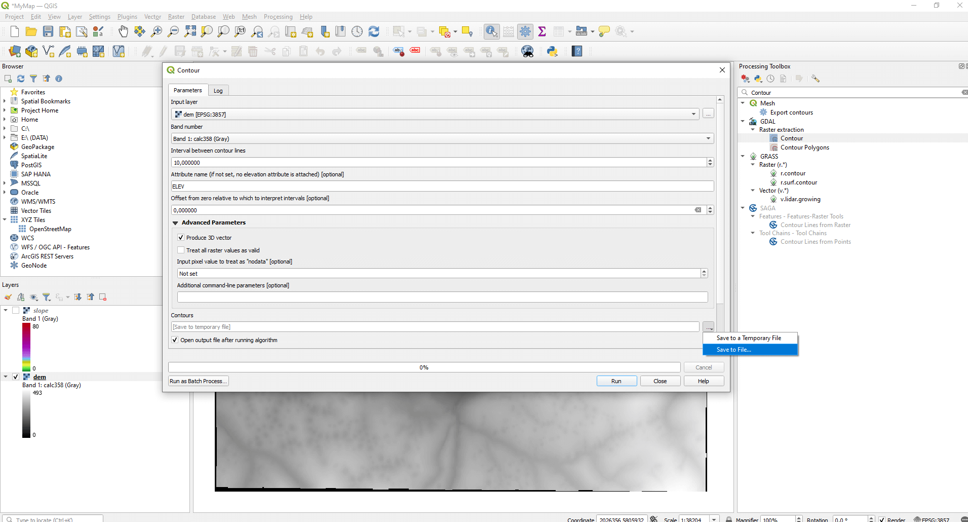
Create contour lines based on the DEM. Type “Contour” into the “Processing Toolbox Panel”. Choose the function under the “Raster extraction” out of the GDAL functions. Set the DEM as an input layer. You can set the interval of the contour lines with the “Interval between contour lines” option. You can also set the column under which the height values are displayed in the attribute table, by default this will be the “ELEV” column. Important to mention that under “Advanced parameters” you can determine the lines to be created as 3D files (“Produce 3D vector”). This is useful if you would import these lines into CAD or 3D modeling environments. Finally, if you want to import your contour lines as files, you have the option to choose from lots of different formats. For this example, I saved my file as a shapefile. Press the “Run” button.
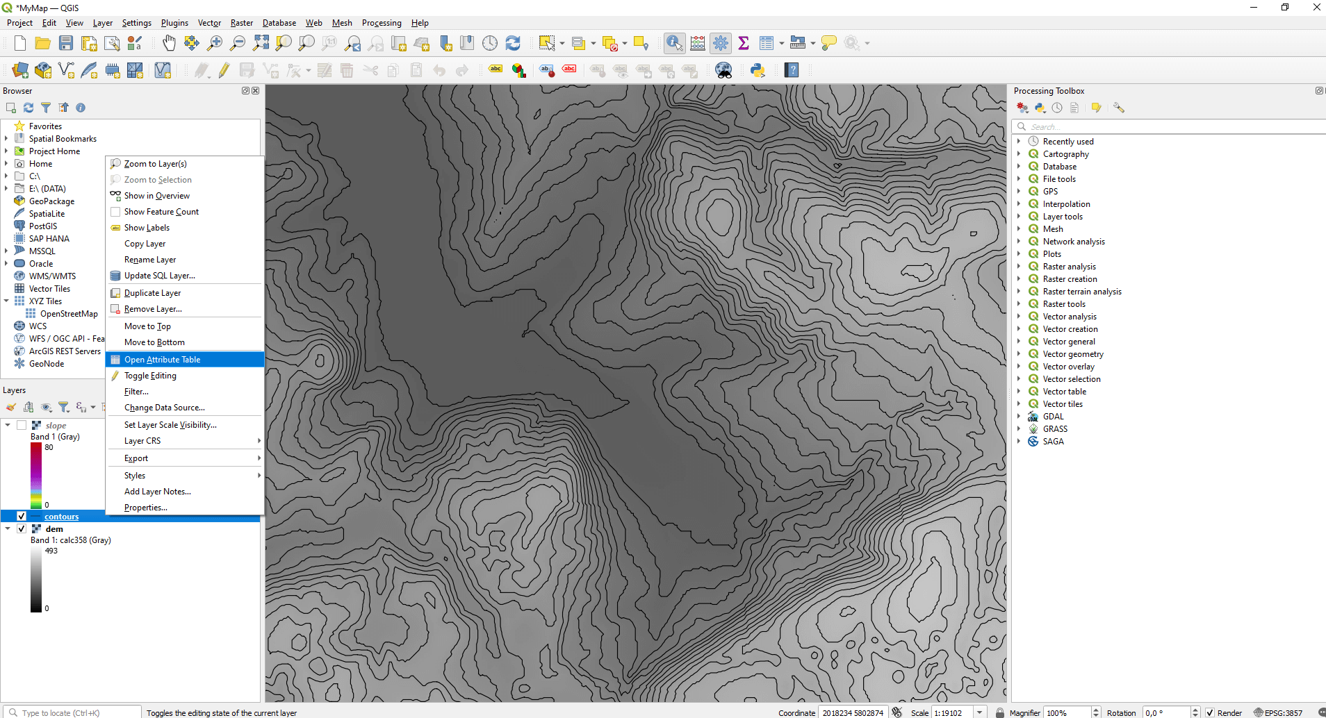
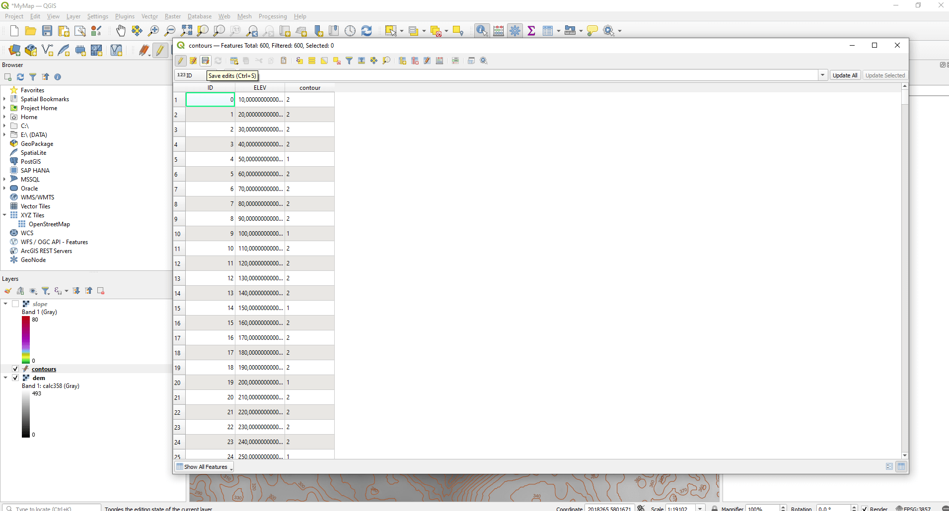
If you want to separate the main contour lines from base contour lines you need to open the layer attribute table of the contour lines. Right click to the layer, then “Open Attribute Table”.
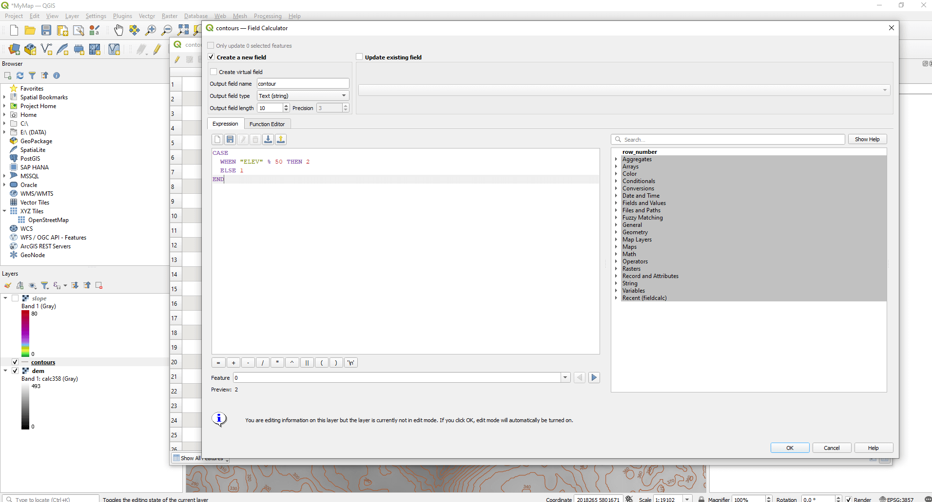
Click to the abacus shaped icon (“Open Field Calculator”).
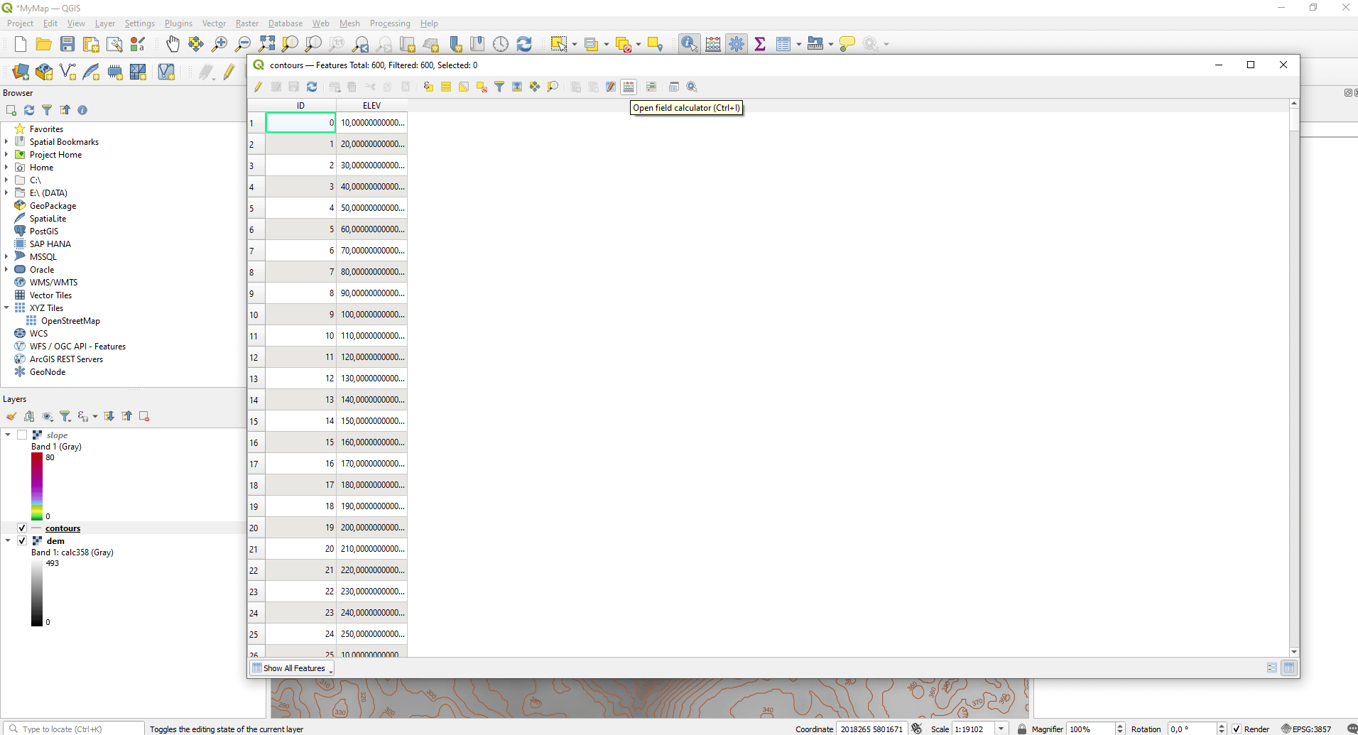
Create a new column (“Create a new field”), set the name of it (“Output field name”) and for the “Output field type” option set “Text (String)”. Under “Expression”, type in the following:
CASE
    WHEN "ELEV" % 50 THEN 2
    ELSE 1
END
This short code examines whether the values in the row below the “ELEV” column are divisible by 50 or not. If they are divisible, a “1” will be added to that line, which indicates a main contour line. If they are not divisible, a “2” will be added and it will mean a base contour line. Of course, you can set any gap for the main contour line you want. The number 50 set by me is just a fictional value. Run it with the “OK” button.
Click on “Save edits” then click on the pencil shaped “Toggle editing mode” two to the left to close the editing.
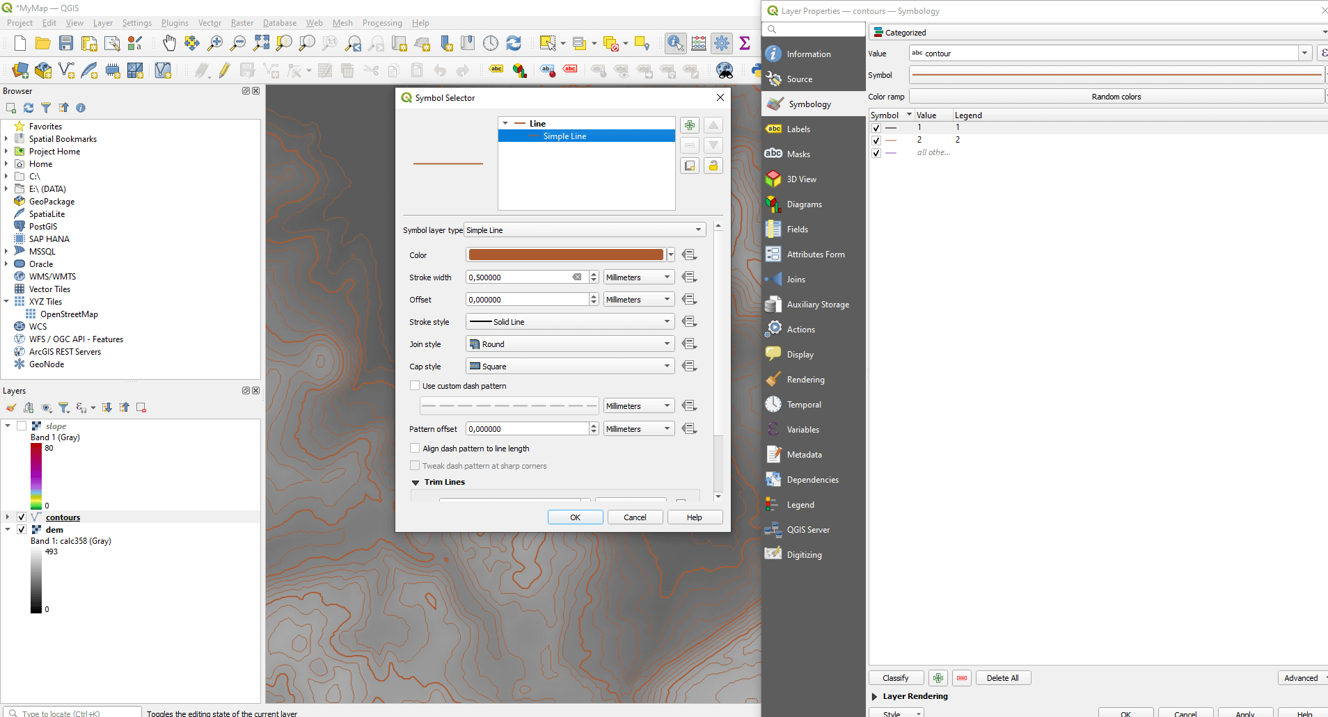
Set the style. Double click to the layer, then choose the “Categorize” value from the “Symbology” dropdown list. From the “Value” list you choose the previously created “contour” column, then click on the “Classify” button a few rows below. the previously created “1” and “2” values appear. Double click to the “1”, then select “Simple Line”, which is under the “Line” subtitle. Set brown color next to the “HTML notation”. I usually set „#ac5b31” value.
Interesting fact: On old Hungarian paper maps the contour lines had a so-called “sárkányvér” color, which means dragon’s blood in English. Quite badass isn’t it? 🙂
Set the “Stroke width” to 0,5mm and it’s important to set the “Join style” to “Round”. Do the same process with “2”, the only difference is the stroke width, which should be 0,25mm. Press the “Apply” button.
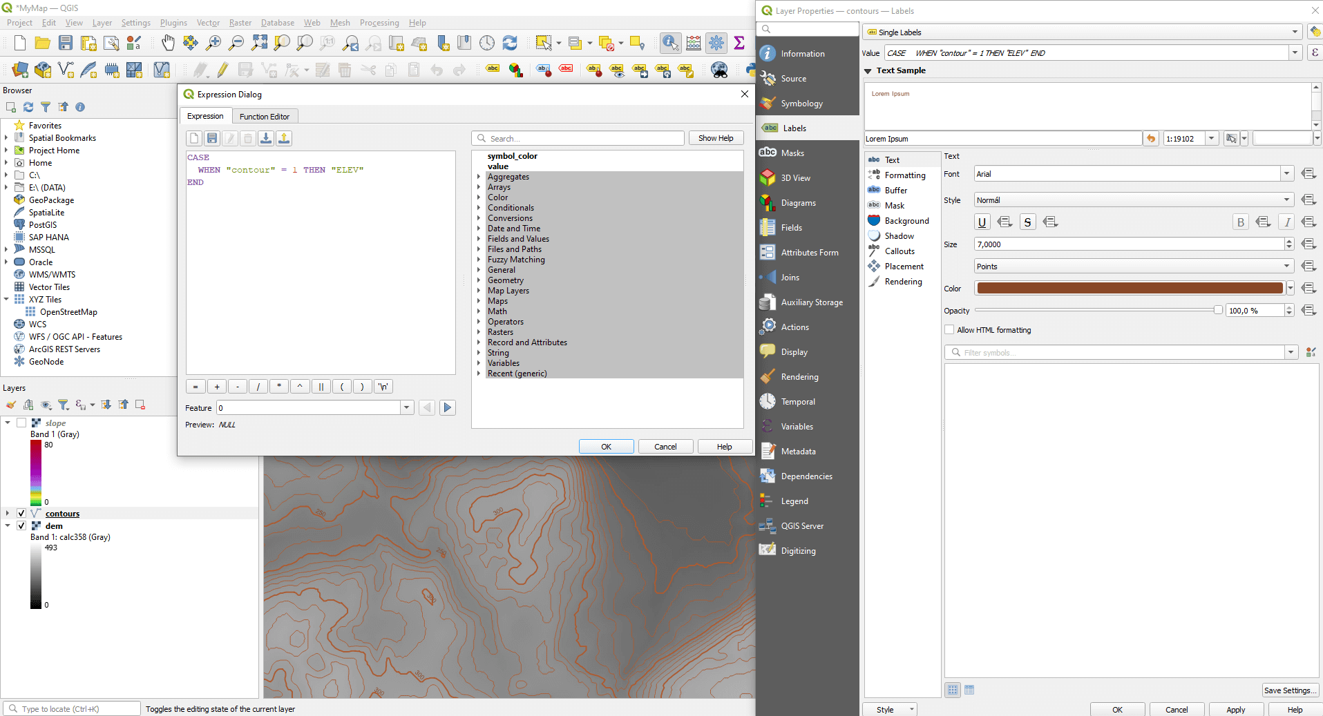
Go to the “Labels” tab and choose the “Single Labels” option. Next to “Value”, click the “Expression Dialog” button after the drop-down list. Enter the following code:
CASE
    WHEN "contour" = 1 THEN "ELEV"
END
This code allows that only the main contour lines will get subtitles. You can set the size, color and location of the labels too. I usually set the color a few shades darker than the contour lines. Once you are ready with the settings, press the “OK” button.
Save the QGIS project file and move on. 🙂
SHADE EFFECT, for THE 2.5D EXPERIENCE
The purpose of the shade effect is to make the map content as realistic as it can and create a more plastic effect, so to make the topographical elements (positive and negative forms) kind of “jump out” of the screen.
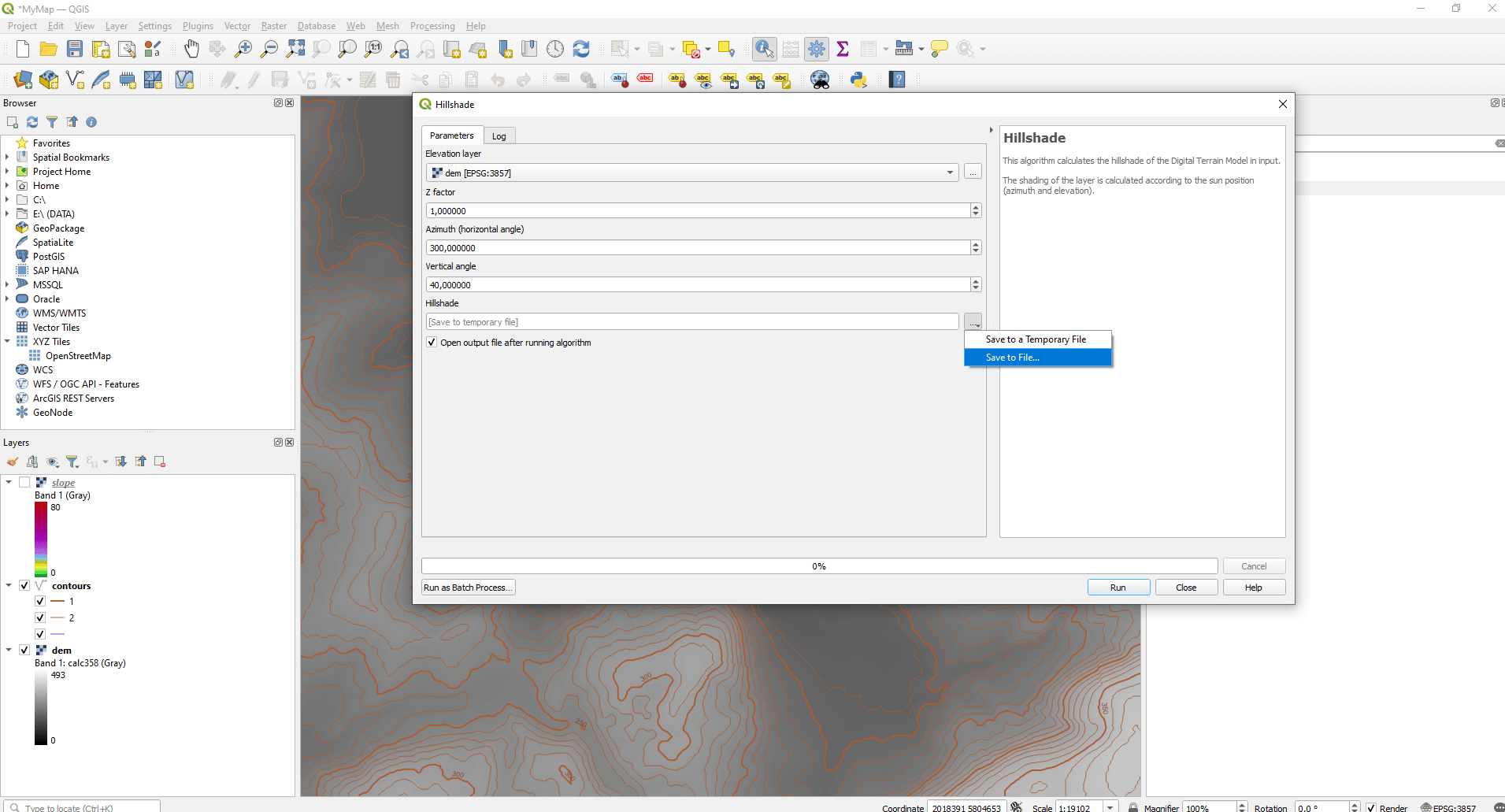
Type “Hillshade” into the “Processing Toolbox Panel”. Here you can choose the “Raster terrain analysis”, with simpler settings, or the more complicated GDAL function. Choose the simpler one, then set the DEM layer under the “Elevation layer”. Take care of the “Azimuth” and “Vertical angle” values. These two are the location of the light source according to the equator and the angle of incidence of the light. Basically the “Azimuth” is set to 300, so the light comes from the northwest. Save the result as a raster file and press the “Run” option.
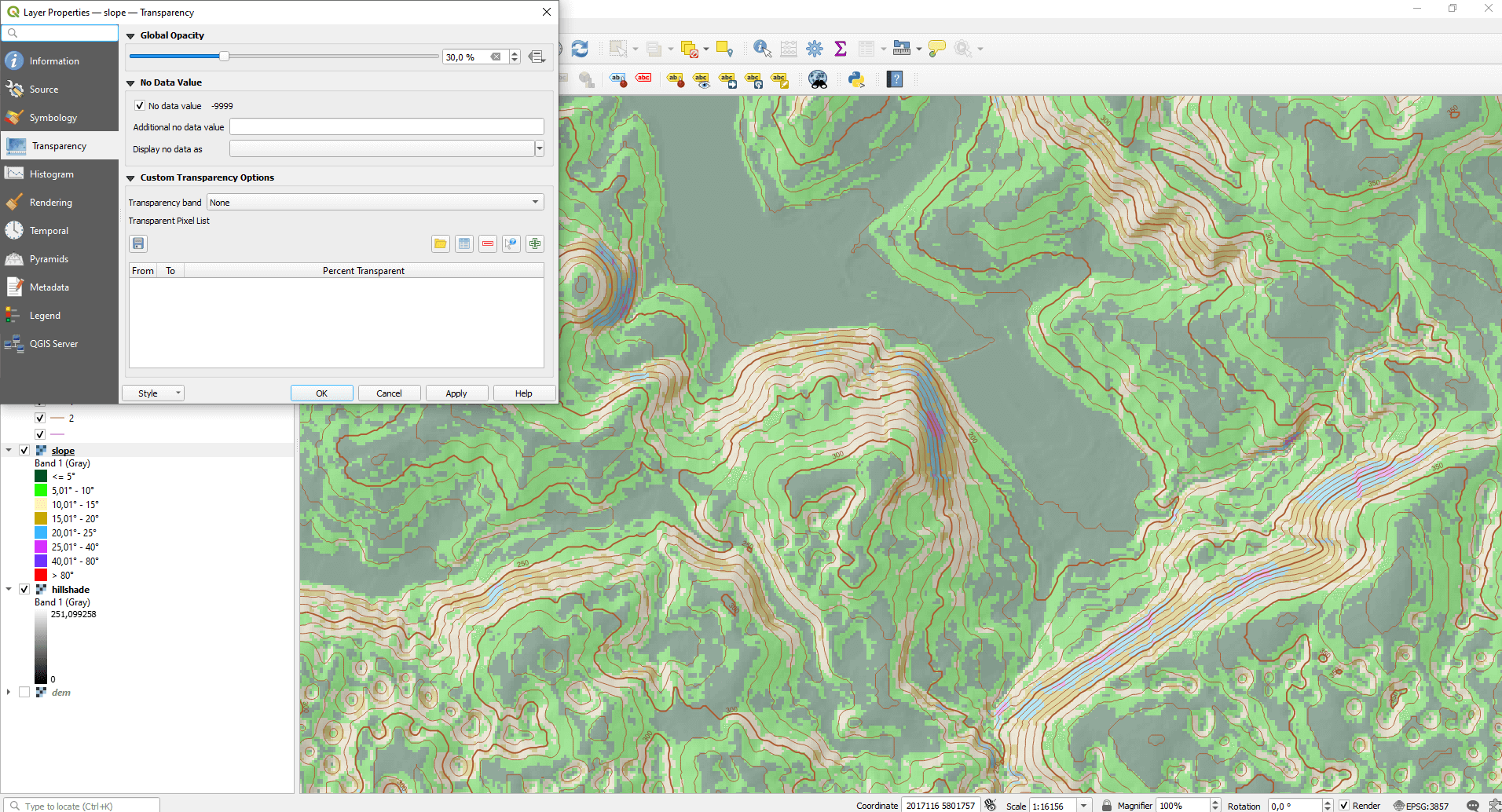
Change the order of the layers (simply drag one layer over the other). The contour lines should be on top, then the slope map. The topography shading should be on the bottom. You can turn off the DEM layer.
Double click to the map layer, then in the “Transparency” tab, set the transparency to 30%, then press “OK”. In my opinion, an extremely well-interpreted map file, which perfectly represents the altitude conditions, was created. Save the project file so you don’t lose this miracle! 🙂
CREATING REAL MAP
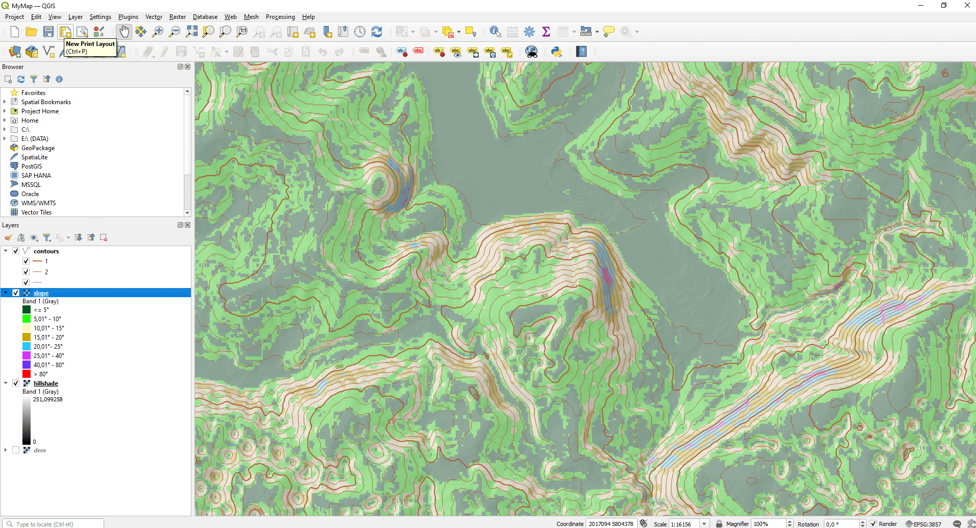
To export a map as an image (svg or pdf), you need to create the layout of the map on a virtual paper. To start, click to the “New Print Layout” in the top menu bar. A small dialog box will appear, set an arbitrary name for it.
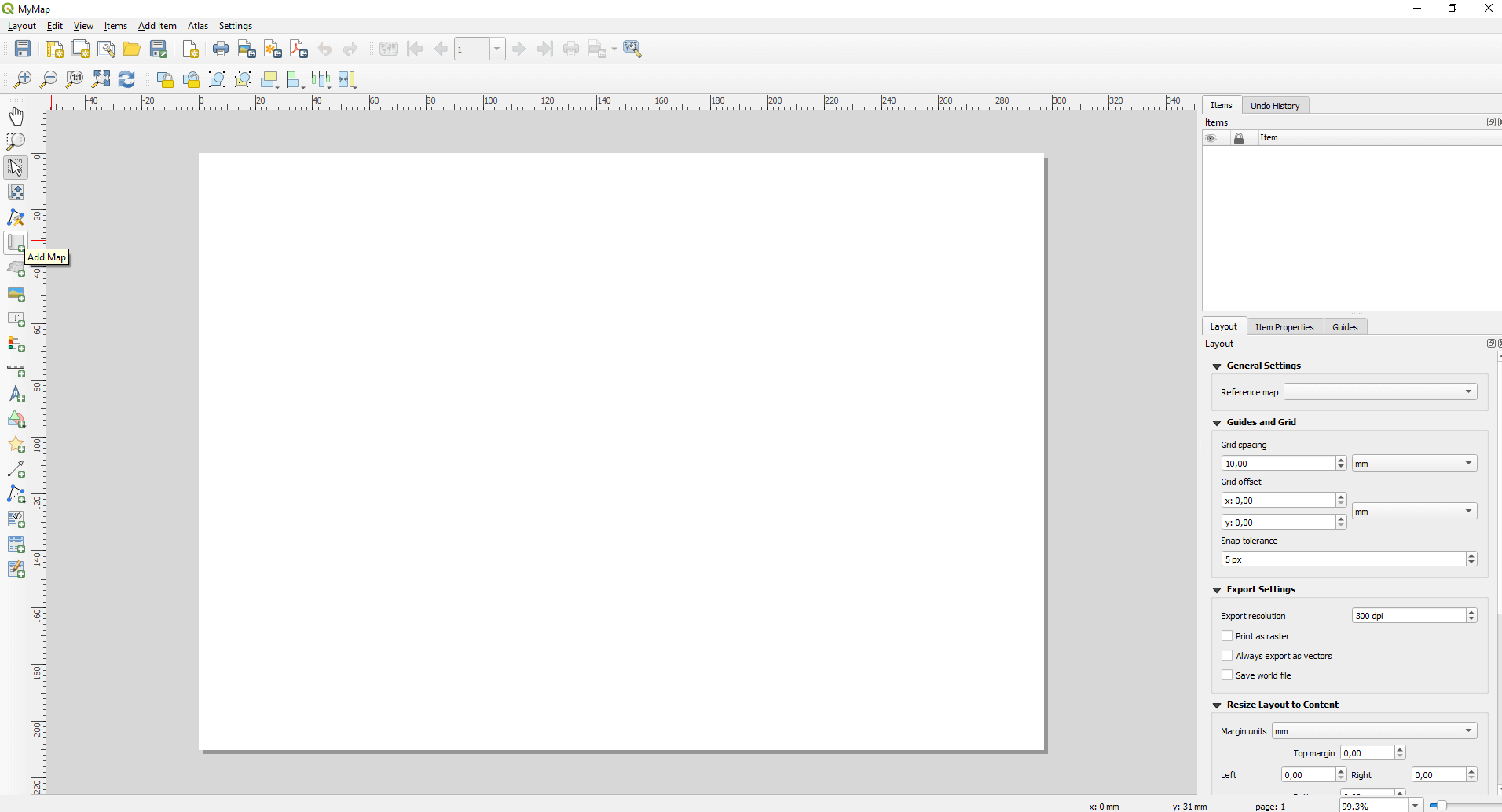
A totally new, very complicated looking window welcomes you. Don’t worry, it won’t be as bad as it might seem now. 🙂
The “Layout” can be saved into the project file, so you can open it whenever you want. Let’s add the layers from the map canvas. This function can be found in the left sidebar and is called “Add Map”. This one also can be found under the “Add Item” option in the top menu bar.
Press the left mouse button in one of the corners of the paper, then select the area you want your map to be displayed. After releasing the button, QGIS will be loading a bit, then the result appears.
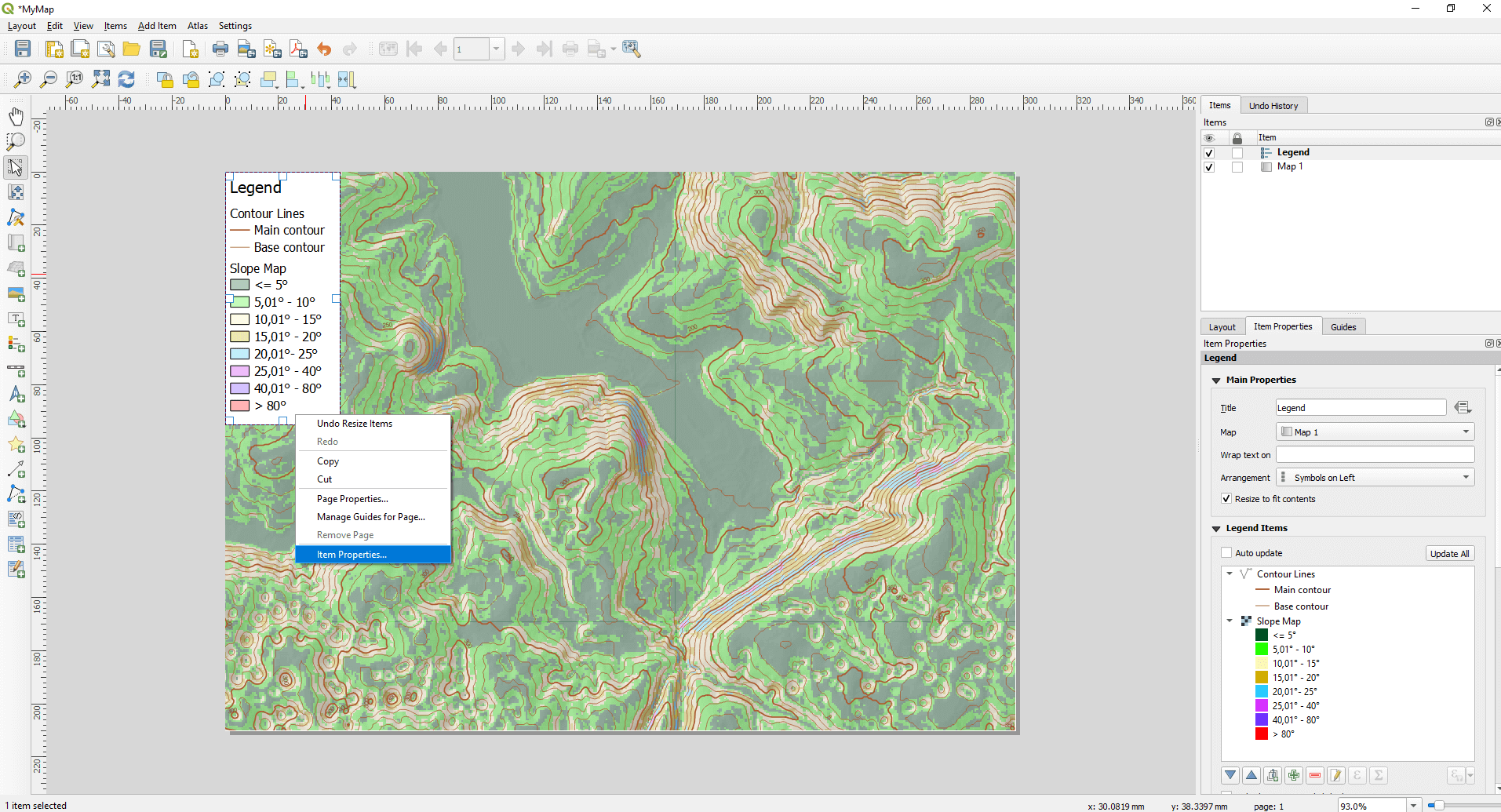
Add a legend from the left sidebar, using the shown area selection method.

The basic legend contains every layer which is not really nice. We can easily solve this if you click on the legend and choose the “Item Properties” local menu. A small window will appear on the right, containing the elements of the legend. If you turn off “Auto update” you can delete elements from the legend, while the content of the map remains exactly the same (because in fact you don’t delete the layers). If you double click to an element, you can rename it, change the font style and size, or you can add a new title to the legend. Technically you can customize everything.
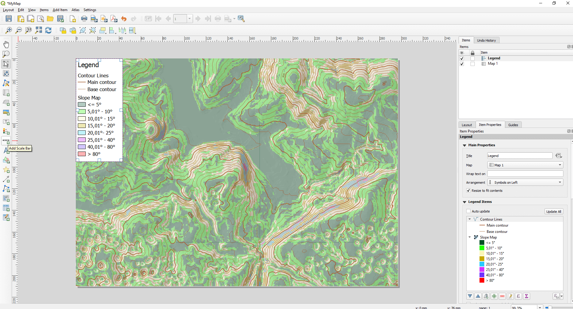
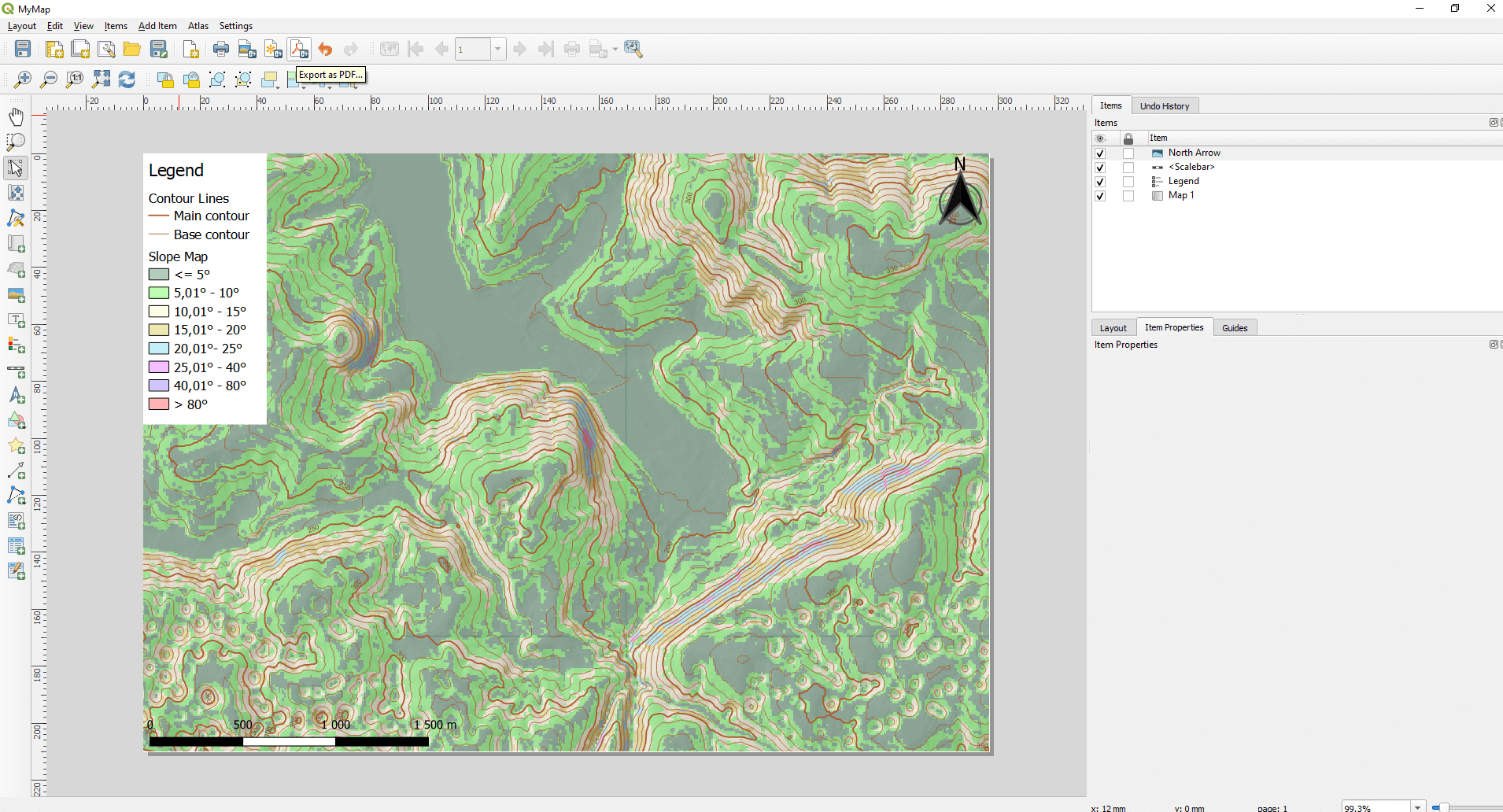
Add a scale bar and a north arrow to the map from the left sidebar by the “Add Scale Bar” and “Add North Arrow” buttons. These are also customizable under the previously presented “Item Properties” menu.
By the way, you can add texts, shapes, images, markers and attribute tables to this view. So you can create a complex map very easily.
After you finish fine tuning, you can export the map as an image (in many formats), and also as PDF or SVG files. These functions can be found in the second menu row.
I hope this article was really useful for you and you will give your customers some real pretty maps.
Did you like what you read? Do you want to read similar ones?
If you really like what you just read, you can share it with your friends via our social media sites. 🙂